For more information, see the online learning platform
The Data Explorer is a great tool for quickly visualizing variables. It is a feature which enables to explore the variables of the project.
Select Visualize → Data Explorer in main menu. A list of tags is displayed on the left side of the page.
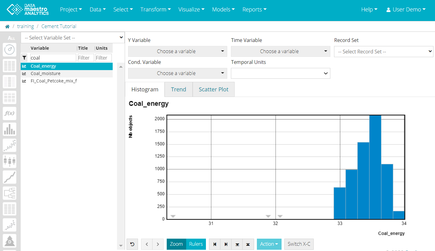
Select a tag using the scroll bar or filter the Variable Name, Title or Unit. As soon as a tag is selected the first graph, a Histogram, is displayed. If no record set is selected, the graph shows all records. To Select a condition for the Histogram. choose a tag in Cond. Variable.
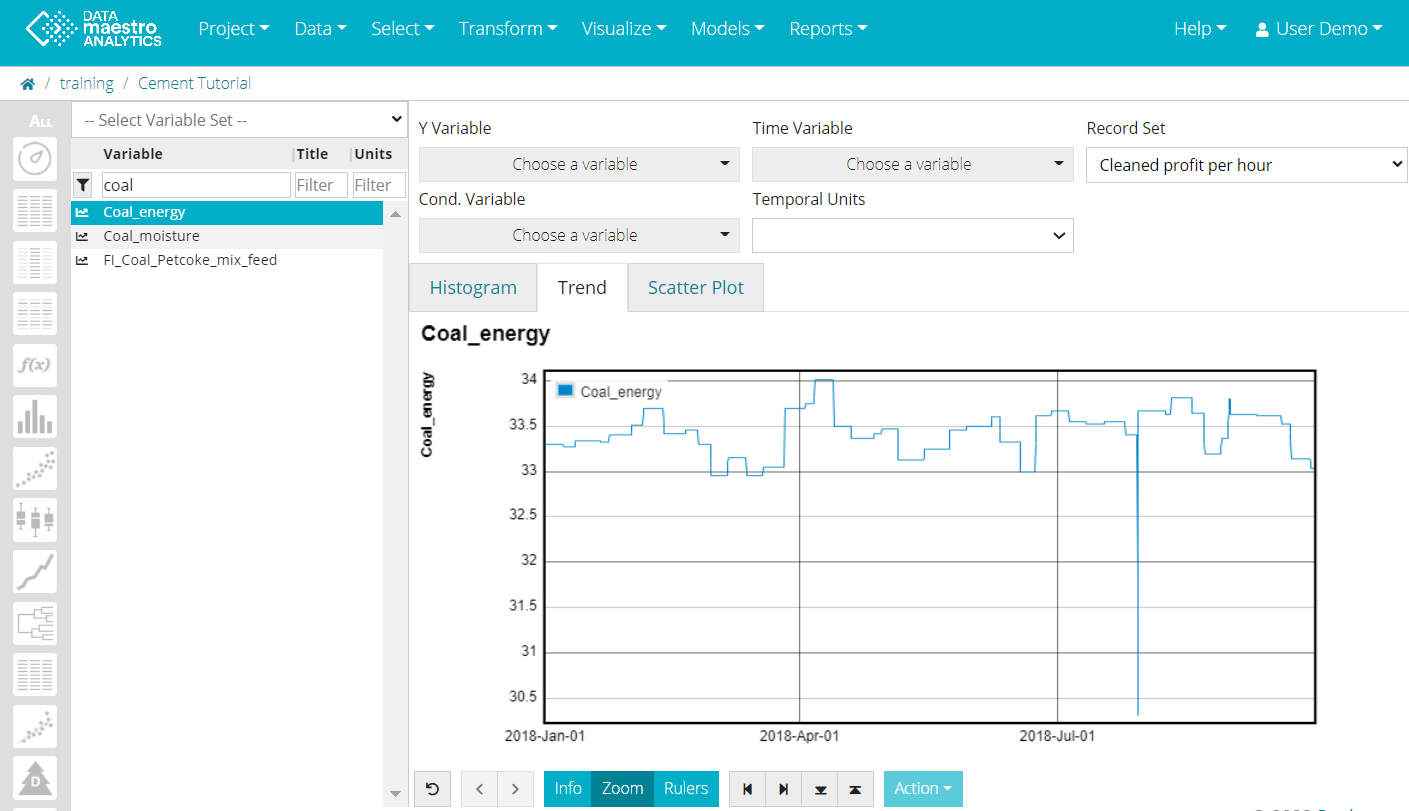
- Click on Trend tab to check the Trend. A Trend is displayed only if the tag is numeric. If no record set is selected, the graph shows all records. Note that If a numeric tag is selected as a condition Cond. Variable for the Histogram or the Scatter plot, the tag will be displayed in Trends. If a symbolic tag is selected as a condition a message appears for e.g. “Tag Name is not numeric” and no Trend is displayed. If a tag is selected as “Y variable” for Scatter plot, it will be displayed in Trends.
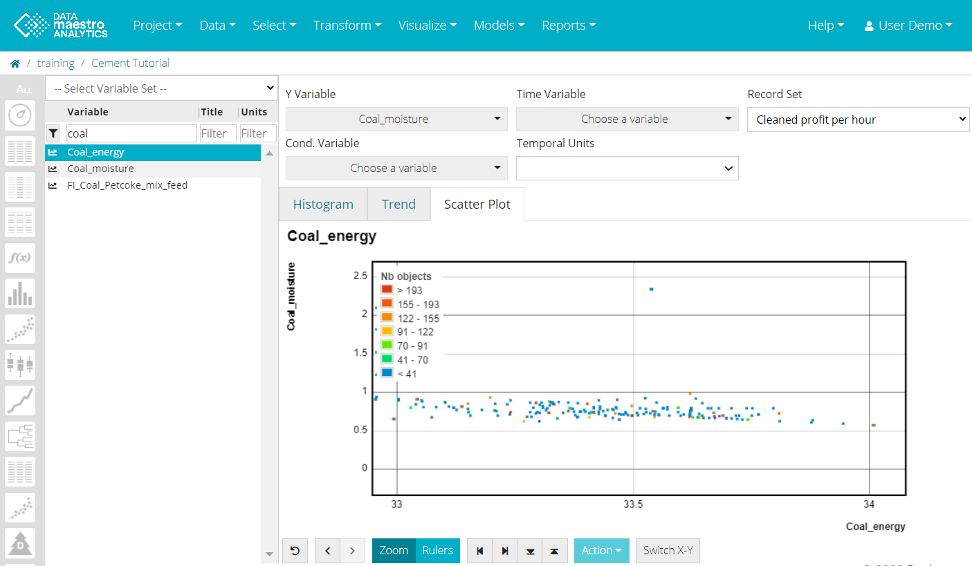
- To visualize a Scatter plot (in Scatter plot tab) - Y axis, to use a condition in the Histogram and, to add another variable in a Trend, select an Y Variable. If no record set is selected, the graph shows all records.
- Select a Time Variable for the Trend curve, if required. Usually the time variable is automatically selected.
- Select Time unit, if required. Options: Excel time, Mac excel time, Unix time (ms) and Unix time (s).
- Select Cond. Variable to use a condition in scatter plot and histogram.
- Select an Record set, if required. Once the record set is selected the filter will be applied to all graphs. If no record set is selected all graphs are built using all records.


There is a control view below the chart to modify the zoom or to apply rulers. There are no advanced features available to enter title, change font size, change legend position, etc. |


