View Trends
For more information, see the online learning platform
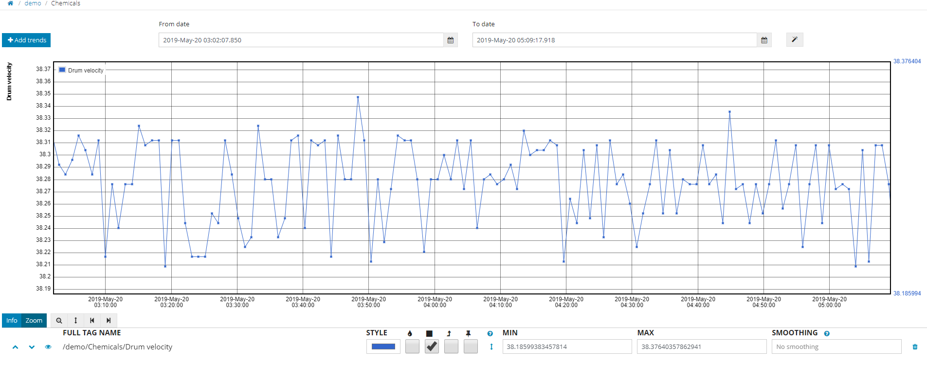
Visualize curves in DATAmaestro Lake for numeric and symbolic variables.
To view trends:
- Click View > Trends in the main menu.
- Select From date, set date followed by hour and minutes (below the calendar).
- Select To date, set date followed by hour and minutes (below the calendar).
Click on magic wand icon to check data's statistics on different time duration. Options: Last minute, Last 5 minutes, Last 15 minutes, Last hour, Last 6 hours, Last 24 hours, Last 7 days, Last 30 days and Last year. |
Add Tags to your Trends
Click + Add Trends in the bottom left of the graphic area.
Choose Folder Name.
Choose Tags from the list. Select the Tag(s) and click on the right arrow to move them across to the Selected tags list. To remove tags from the Selected tags list click on the Tag and click the left arrow.
Note: You may select tags from various directories simultaneously and visualize them together on the trends.
Filter: To help select tags, there is a text search and filter option above the tag list. Tags can be selected by Name, Title and Unit.
Shortcuts: To the right of the text search area, a small arrow provides additional tools: Select All, Select None, Inverse Selection.
Info: Click on the small arrow to the right of the text search area to see the total number of tags, the number of tags selected and the number of tags filtered.
Click OK.

Control the View
Use the control menu below the chart to modify the zoom. For more information, see Control View Menu below.
Drag your mouse to select an area on the chart. Repeat to increase the zoom level.
Click the Magnifying Glass Icon to undo the last zoom operation.
Click Top Bottom arrow to adjust the scale of the vertical axis.
Click Left and Right arrows to move backwards and forwards through the horizontal axis.
- Click on Info to get values from data points along a curve.
Control View Menu
| Menu Item | Name | Description |
|---|---|---|
| Move item | Move a list item |
| View | Show/Hide the curve |
| Style | Change color. Click on the color bar, choose a color from the palette and click OK. |
| Fill curve | Check box to fill below the curve. |
| Data points | Display data points on the trend. |
| Link data points | Link data points with steps instead of interpolation. |
| Extend | Extend the trend beyond the last data point. |
| Fix axis | Activate ruler to fix the minimum and maximum y axis values of each tag. |
| Vertical ruler | Auto fit the y axis to trend data. |
| Remove | Remove tag from the list. |


On Trends in the Lake, you can add dots to a line graph, it turns the line graph looks like a dot graph over. You will be able to check the missing values during a certain period of time. |

The vertical ruler and zoom can configure the minimum and maximum values displayed. |
Smoothing applies a low pass filter based on the previous period. Day = d Hour = h Minute = min Second = s Millisecond = ms e.g. 1d or 15min or 30s |

View New Trends (Beta)
New Lake Trending Beta version available for user testing
|
To view trends:
- Click View > New Trends (Beta) in the main menu.
- Select From date, set date followed by hour and minutes (below the calendar).
- Select To date, set date followed by hour and minutes (below the calendar).
Click on magic wand icon to check data's statistics on different time duration. Options: Last minute, Last 5 minutes, Last 15 minutes, Last hour, Last 6 hours, Last 24 hours, Last 7 days, Last 30 days and Last year. |
Add Tags to your Trends
Click + Add Trends in the bottom left of the graphic area.
Choose Folder Name.
Choose Tags from the list. Select the Tag(s) and click on the right arrow to move them across to the Selected tags list. To remove tags from the Selected tags list click on the Tag and click the left arrow.
Note: You may select tags from various directories simultaneously and visualize them together on the trends.
Filter: To help select tags, there is a text search and filter option above the tag list. Tags can be selected by Name, Title and Unit.
Shortcuts: To the right of the text search area, a small arrow provides additional tools: Select All, Select None, Inverse Selection.
Info: Click on the small arrow to the right of the text search area to see the total number of tags, the number of tags selected and the number of tags filtered.
Click OK. Repeat the steps each time you add a new band.
| Drag & Drop Tags to change order or switch from Left to Right Trends. |
In the Lake, there is a new Trending feature available that lets you put multiple variables on the Y axis, multiple variables on the Y’ axis and add banding (multiple trends, one below the other). You can Add, Delete and Switch Bands.
|


In case the trending tool bar is hidden, you can click on the icon ( |

Control the View
Use the control menu below the chart to modify the zoom. For more information, see Control View Menu below.
Drag your mouse to select an area on the chart. Repeat to increase the zoom level.
Undo & Redo zoom.
Click the Magnifying Glass Icon to undo the last zoom operation.
Click Top Bottom arrow to adjust the scale of the vertical axis.
Click Left and Right arrows to move backwards and forwards through the horizontal axis.
Zoom out time (X axis only).
- Click on Info to get values from data points along a curve.
Control View Menu
| Menu Item | Name | Description |
|---|---|---|
| Pin/Unpin | Pin the y axis for the trend. |
| Drag & Drop Tags | Change order or switch from Left to Right Trends. |
 | Lock/unlock | In Right Trends, lock to share Y axis. |
| Show/hide | Show/hide curve. |
| Style | Change color. Click on the color bar, choose a color from the palette. |
| Settings | Set Trend style. |
| Fill curve | Check box to fill below the curve. |
| Data points | Display data points on the trend. |
| Link data points | Link data points with steps instead of interpolation. |
| Extend | Extend the trend beyond the last data point. |
| Smoothing | Smoothing applies a low pass filter based on the previous period. Day = d Hour = h Minute = min Second = s Millisecond = ms e.g. 1d or 15min or 30s |
| Vertical ruler | Auto fit the y axis to trend data. |
Remove | Remove tag from the list. | |
| Pin | Click once to over the trending toolbar above the trend, click twice to pin the toolbar below the trend |
| Hide | Hide the trending toolbar. |
| Show toolbar | Show the trending toolbar in case it is hidden. |


Trend symbolic tags choosing between a step or a chronogram visualization:
- Add symbolic variables to an existing trend band (visualised as steps).
- First add a symbolic variable to see the Y axis with symbols (also visualized as steps).
- Create a separate band for symbolic trends visualized as a chronogram.
Use the info tool bar and hover over symbols to highlight other periods with the same symbol. |

Symbolic variables are visualized as steps where each level represents a symbol (E.g. High, Medium or Low). |

Configure a symbolic trend:
- Select the Edit button to add points to the graph.
- Extend symbol before or after the measured time.
- Switch to a chronogram view.
- Send the tag to another band.
- Change the order of symbols.
 View Raw data
Visualize raw data in DATAmaestro Lake.
To view raw data:
- Click View > Raw data in the main menu.
- Select Start date, set date followed by hour and minutes (Optional).
- Choose Folder Name.
- Choose Tags from the list. Select the Tag(s) and click on the right arrow to move them across to the Selected tags list. To remove tags from the Selected tags list click on the Tag and click the left arrow.
- Note: You may select tags from various directories simultaneously and visualize them together on the trends.
- Filter: To help select tags, there is a text search and filter option below the tag list. Tags can be selected by Name, Title and Unit.
- Shortcuts: To the right of the text search area, a small arrow provides additional tools: Select All, Select None, Inverse Selection.
- Info: Click on the small arrow to the right of the text search area to see the total number of tags, the number of tags selected and the number of tags filtered.
- Click View. A list, with the first 100 records, appears on the bottom of the page. Click on the forward-backward arrows to browse through the table.

View Statistics
Visualize data statistics (number of observations - count, missing count, mean, standard deviation, maximum and minimum values) in DATAmaestro Lake.
To view statistics:
- Click View > Statistics in the main menu.
- Select Start date, set date followed by hour and minutes (Optional).
- Note: If no date is selected, by default the statistics will cover the entire period.
Select End date, set date followed by hour and minutes (Optional). Each time a choice is made the window changes for each time step.
Click on magic wand icon to check data's statistics on different time duration.
Options: Last minute, Last 5 minutes, Last 15 minutes, Last hour, Last 6 hours, Last 24 hours, Last 7 days, Last 30 days and Last year.
- Choose Folder Name.
- Choose Tags from the list. Select the Tag(s) and click on the right arrow to move them across to the Selected tags list. To remove tags from the Selected tags list click on the Tag and click the left arrow.
- Note: You may select tags from various directories simultaneously and visualize them together on the trends.
- Filter: To help select tags, there is a text search and filter option below the tag list. Tags can be selected by Name, Title and Unit.
- Shortcuts: To the right of the text search area, a small arrow provides additional tools: Select All, Select None, Inverse Selection.
- Info: Click on the small arrow to the right of the text search area to see the total number of tags, the number of tags selected and the number of tags filtered.
- Click View statistics. A list appears below containing basic statistical information, for each selected tag, such as: number of observations (count), missing count, total count, mean, standard deviation, maximum and minimum values.
