Versions Compared

Key

  • This line was added.
  • This line was removed.
  • Formatting was changed.

English us

For more information, see the online learning platform

A scatter plot consists of a 2D representation of one variable along the Y-axis, compared to another variable along the X-axis. The third component, the condition variable, is not required, but can be used to reveal additional information in the scatter plots.

The resulting view is usually called a scatter-plot given the dispersed appearance of the data. A scatter plot can be used with both numerical and symbolic variables.

To launch the scatter plot editor, select Visualize > Scatter Plot from the menu. Alternatively, click the icon () in the sidebar and then add New.

Create a Scatter Plot

The parameters for a scatter plot are defined on two tabs at the top of the page: Data and Properties.

On the Properties tab: 

  1. Select a Record set from the list.
  2. Select from the Variable list to set variables for X and for Y, and one for C (Condition), if required.
Tip
titleFind a Variable

Variables are listed alphabetically. To find a variable, use the scroll bar or enter the name in the Variable field.

On the Advanced tab:

  1. Enter a chart Title
  2. Enter Font Size, if required. 
  3. Select Legend Position. The Default position is on the left-corner of the graph. You can also have the option of have no legend (None). 
  4. Enter a Generalization level. For more information, see Generalization level.
  5. Select Show statistics to display standard deviations and average values. A bell curve displays corresponding to the theoretical normal (Gaussian) distribution using the mean (average) and standard deviation of the selected record set.
  6. Select Show Linear RegressionIt is the simplest form of regression. The data is modeled as a linear combination of input variables to create an output predictive model. The model searches a line (y=ax+b) that fits best the data. The task is to find coefficients (weights) to provide the best fit to the training data. The value of the coefficient quantifies the strength of the relation between the output and the different inputs.
  7. Select a Plot type from the drop down list (Values versus Density plot): 
    1. The Values option is a cartesian coordinate graph type (X-Y plot) displaying two or three variables (third variable can be displayed if a condition (cond.) is designated).
    2. Density plot type is selected, the third variable is replaced by a value representing the density or number of data points per value range.
  8. Enter Conditional Class Count, if required, use the arrow buttons, default 3.The number of buckets for the condition or number of discretized groups for a conditional variable added as color coding to Histograms and Scatter Plots. For more information, see Conditional class count
  9. Select the X Temporal Units to display a numerical date value as a date on the X  axis select the relevant date format. All files uploaded since DATAmaestro 4.0 will have dates converted to Unix time (ms).
  10. Define zoom area using X axis, Y axis. Enter values for X and Y axis. If X axis is a time variable then select a date in the calendar. 
  11. Click Save to load the data.
Tip
titleChange number buckets

To change the number of buckets for the Condition, use Class Count.

Control the View

Use the control menu below the chart to modify the zoom, apply rulers to create new record sets. For more information, see Control Menu.
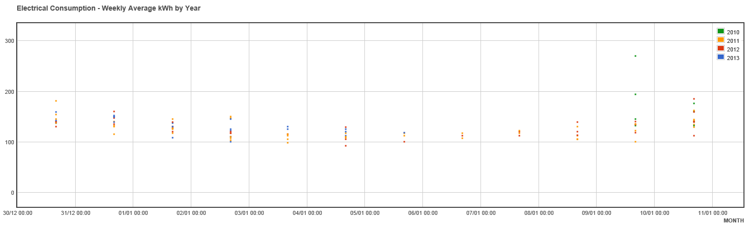

Info
titleSwitch X-Y

Click on Switch X-Y button  to switch x an y axis. 


Info
titleCopy/Save Scatter plot

To copy or save the curve click on the curve with the right click and select Copy image or Save image as


Info
titleHow to confirm if two variables are correlated?

A scatter plot can show you how two variables are correlated. For example, two variables can be put on either axis and the scatter plot can show the degree of correlation (not causation) between them. Correlations may be positive (rising, dots slope from lower left to upper right), negative (falling, dots slope from upper left to lower right) and none (uncorrelated). 

Example Visualization

The following example illustrates the weekly average electrical consumption (kWh) by year.


Japanese

散布図


散布図

散布図は 2 つの属性が 2 次元で表現されます。1 つの属性が Y 軸に沿って表示され、対するもう一つの属性が X 軸に沿って表示されます。3 番目の要素である条件属性は必須ではありませんが、散布図の追加情報を明らかにするために使用することができます。

一般的に、結果の図は、データが分散したように見えるため、「散布図」と呼ばれます。散布図は数値属性と記号属性の両方で使用できます。

散布図エディターを起動するには、メニューから [視覚化] > [散布図] を選択します。あるいは、サイドバーのアイコン () をクリックして、[新規] をクリックします。

散布図の作成

散布図のパラメーターは、ページの上部にある[データ] および [プロパティ] という 2 つのタブで定義されます。

[プロパティ] タブ: 

  1. リストからオブジェクトセットを選択します。
  2. [属性] リストから選択し、X および Y の属性と、必要に応じて C (Condition) の属性を選択します。

属性を検索する

属性はアルファベット順に一覧表示されます。属性を検索するには、スクロールバーを使用するか、[属性] フィールドに名前を入力します。

[詳細] タブ:

  1. グラフのタイトルを入力します。 
  2. 必要に応じて、フォントサイズを入力します。 
  3. 凡例の位置を選択します。既定の位置はグラフの左端です。凡例を表示しない (なし) こともできます。 
  4. 一般化レベルを入力します。詳細については、一般化レベルを参照してください。
  5. [統計情報を表示] を選択すると、標準偏差と平均値が表示されます。表示される正規分布曲線は、理論的な正規分布 (ガウス) に対応し、選択したオブジェクトセットの平均と標準偏差を使用します。
  6. [線形回帰を表示] を選択します。これは最もシンプルな回帰の形態です。データが入力変数の線形の組み合わせとしてモデル化され、出力予測モデルを作成します。モデルはデータに最適な直線 (y=ax+b) を検索します。この作業は、係数 (重み) を見つけ、学習データに最適な一致を求めることです。係数の値は、出力と異なる入力の間の関係の強さを数量化します。
  7. ドロップダウンリストから [プロットタイプ] を選択します (値または密度プロット)。  
    1. [値] オプションはデカルト座標グラフタイプ (X-Y プロット) であり、2 つまたは 3 つの変数を示します (条件が指定されている場合は、3 番目の変数を表示できます)。
    2. [密度] プロットタイプが選択されます。3 番目の変数は、密度を表す値または値範囲ごとのデータポイント数で置き換えられます。
  8. [条件クラス数] を入力し、必要に応じて矢印ボタンを使用します。既定値は 3 です。条件のバケット数または条件属性の離散グループ数が色分けされてヒストグラムと散布図に追加されます。詳細については、条件クラス数を参照してください。 
  9. X 軸に日付として数値日付値を表示する X 時間単位を選択し、関連する日付を選択します。DATAmaestro 4.0 以降でアップロードされたすべてのファイルでは、日付が Unix 時間 (ミリ秒) に変換されます。
  10. X 軸Y 軸を使用してズーム領域を定義します。X 軸と Y 軸の値を入力します。X 軸が時間変数の場合は、カレンダーの日付を選択します。 
  11. [保存] をクリックしてデータを読み込みます。

バケット数を変更する

条件のバケット数を変更するには、クラス数を使用します。

ビューの制御

ズーム倍率を変更するには、グラフの下のコントロールメニューを使用します。新しいオブジェクトセットを作成するには、ルーラーを適用します。詳細については、制御メニューを参照してください。


X-Y の切り替え

X 軸と Y 軸を切り替えるには、[X-Y の切り替え] ボタンをクリックします。 

散布図のコピー/保存

曲線をコピーまたは保存するには、曲線を右クリックして、[画像のコピー] または [名前を付けて画像を保存] を選択します。 

どのようにすれば 2 つの属性に相関関係があるかどうかを確認できますか。

散布図は 2 つの属性の間にどのような相関関係があるのかを示すことができます。たとえば、2 つの属性をいずれかの軸に配置し、散布図で属性間の相関関係 (因果関係ではない) の度合いを示すことができます。相関関係は正 (上昇、左下から右上に向かう点の傾き)、負 (下降、左上から右下に向かう点の傾き)、なし (相関関係なし) の場合があります。 

視覚化の例

次の例は、年別週間平均電力消費量 (kWh) の図を示します。