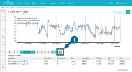
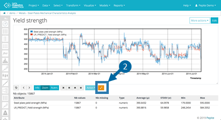
DATAmaestro provides numerous visualization tools to explore your data. Depending on your project needs, you may use one of more of the following: Use the control menu below the chart to modify the zoom level, apply rulers to create new record sets, and to export. | Menu Item | Name | Description |
|---|
| Reset | Reset zoom to the original level. | | Back/Forward | Undo and redo zoom operations. | | Zoom | Activate zoom mode for mouse movements (default). | | Rulers | Activate ruler mode for mouse movements. | | Vertical Rulers | Show/hide the left or right ruler, and be able drag them to precise X-axis values on the chart. | | Horizontal Rulers | Show/hide the top or bottom ruler, and be able to drag them to precise Y-axis values on the chart. | | New record Set | Create a new subset of records defined by setting the rulers. Click Action and New Record Set to open the Record Set editor and review variable filters for the new Record Set. | | Switch X-C | In Histograms, switch X axis and C (as Condition). | | Switch X-Y | In Scatter plot and Box plot, switch X and Y axis. | | Save zoom | Save zoom area. Note that in Advanced tab, the X , Y or Y' axis display the Min and Max values of the saved area. | | Remove saved zoom | Remove the saved zoom area. |
Edit a Chart- To open the chart editor and revise any of the chart parameters, click Edit.
- Make your revisions and click View to see the changes.
Modify the Zoom - Click Zoom to activate zoom mode.
- Drag your mouse to select an area on the chart. Repeat to increase the zoom level.
- Click Back to undo the last zoom operation.
- Click Reset to restore the original zoom.
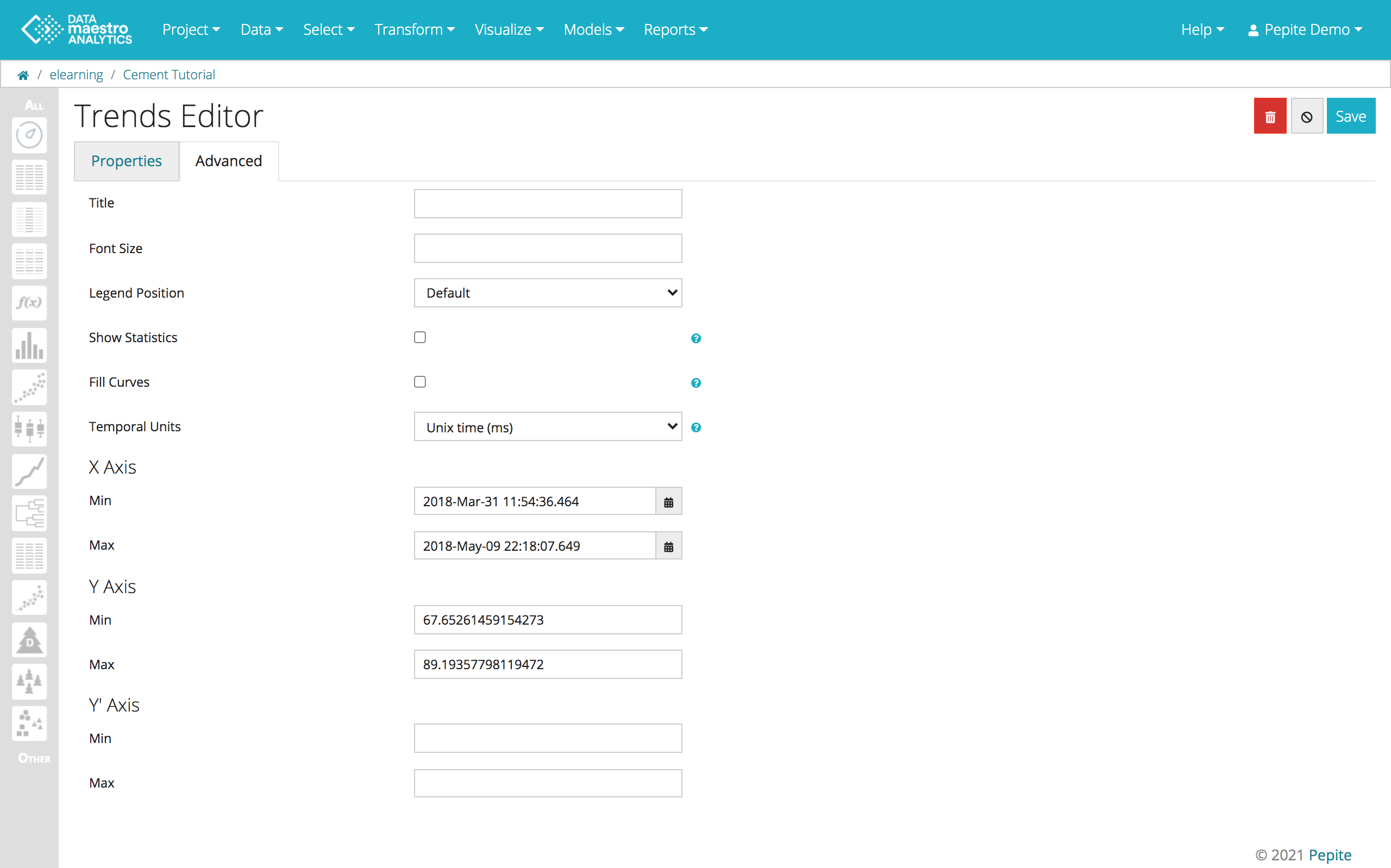
Save Zoom and axes - Zoom on your chart. Click Save.
 - Reset original zoom.
 Alternatively, define axes scales on the Advanced tab of any Visualization chart
Apply RulersYou can use rulers to define a new record set and eliminate values that are abnormal or out of range. - Click Rulers to activate rulers mode.
- Click the appropriate arrow to display a ruler: left/right or top/bottom.
- Drag the ruler to a position on the chart. The exact X or Y axis value is displayed.
- To create a subset comprising records that are within the rulers area, select New Record Set and click Apply.
- In the Record Set editor, enter a name for the new record set, and review the variable filters implied by the rulers you applied. Revise, if required.
- Click Save to validate the new record set.
- To see your revision:
- Select your chart in the sidebar and click Edit.
- Select the new Record set you created and click View. The out of range values have been eliminated.
More Actions - Click More actions to choose General Actions.
- Click Clone to clone the chart.
- Click Download data to download a .csv file containing the basic statistics table located below the chart.
- To export the graphic click on Export graphic as. Options: SVG, PDF and PNG.
|