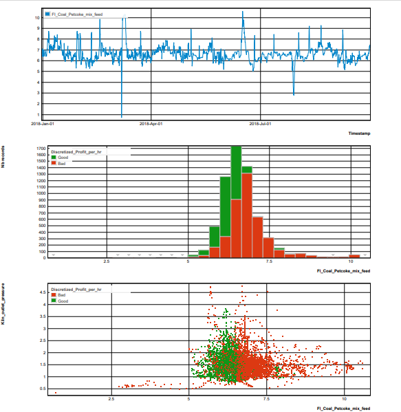
For more information, see the online learning platform It is a feature which enables the creation of a report containing a Trends, a histogram and scatter plots. The variable defined in Var. is the main variable and is compared to those defined in Comp. The time variable is defined in Time. If required, a conditional variable for the histogram and scatter plots, can be defined in Cond. Create a MultiplotTo launch the Multiplot editor, select Visualize > Multiplot from the menu. Alternatively, click the icon ( Image Modified) in the sidebar and then add New. Image Modified) in the sidebar and then add New. The parameters for a Multiplot are defined on two tabs at the top of the page: Properties and Advanced. On the Properties tab: Enter a Title. Select an Record set from the list, if required Select from the Variable list to set variables for the main Variable (Var.) , for the variables to be compared with, in Comp., for Time variable (selected automatically) and one for condition (Cond.), if required. - Click Save to visualize the standard report.
On the Advanced tab: Trends: one curve is displayed for the variable presented in Var. - Enter a Title, if required.
Check Fill curves, if required. Select Temporal unit, options: None,Excel time, Mac excel time, Unix time (ms), Unix time (s). All files uploaded since DATAmaestro 4.0 will have dates converted to Unix time (ms).
Histogram: one histogram is displayed for the variable presented in Var. using a condition, in Cond., if required . - Enter Title, if required.
Enter Cond. class count, if required, use the arrow buttons, default 3. For more information, see Condition class count. Select Plot type, options: Histogram, Pareto and Cumulative Plot. For more information, see Histogram. Check Use relative frequencies. For more information, see Histogram.
Scatter plots: different scatter plots are displayed each one with the variable Var. in axis X and the compared variable in axis Y, using a condition, in Cond., is required. - Enter Title, if required.
Enter Class Count, if required, use the arrow buttons, default 3. Select a Plot type from the drop down list (Values versus Density plot). For more information, see Scatter Plot. Enter a Generalization level. For more information, see Generalization level. Select the X Temporal units to display a numerical date value as a date on the X axis select the relevant date format, if required.
|