...
| English us | |||||
|---|---|---|---|---|---|
For more information, see the online learning platform It is a visual tool that uses bars to summarize data among categories. The bar chart consists of two axis X and Y. The X axis is the time variable (discretized based on the period type) and the Y axis variable can be one or several numerical variables. The period type can be changed: year, month, week, day, hour, minute and second. The variable summary type (based on sum, average, min or max) and a scale factor (multiplication factor) can also be selected. Create a Summary Chart:To launch the Summary Chart editor, select Visualize > Summary Chart from the top menu. The parameters for a summary chart are defined on two tabs at the top of the page: Properties and Advanced. On the Properties tab:
On the Advanced tab:
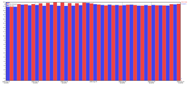
Example Summary ChartAverage of gas flow and gas pressure of foam seal per hour.
|


| Japanese |
|---|
集計グラフ集計グラフ棒を使用してカテゴリ間のデータを集計する視覚的なツールです。棒グラフには 2 つの軸の X と Y があります。X 軸は時間属性です (期間タイプに基づいて離散化)。Y 軸属性は 1 つ以上の変数にすることができます。年、付き、週、日、時間、分、秒といった期間タイプは変更できます。属性集計タイプ (合計、平均、最小、最大に基づく) と倍率も選択できます。 集計グラフの作成集計グラフエディターを起動するには、トップメニューから [視覚化] > [集計グラフ] を選択します。 集計グラフのパラメーターは、ページの上部にある[プロパティ] および [詳細] という 2 つのタブで定義されます。 [プロパティ] タブ:
[詳細] タブ:
集計グラフの例1 時間ごとの発泡シール材のガス流量とガス圧力の平均値。
|
...