Create dashboard
| Info |
|---|
| Note that a dashboard is always related to a DATAmaestro Analytics project. |
To create a dashboard: Enter on DATAmaestro Analytics project. On the vertical menu bar, click on the first icon  , click on View. , click on View. Enter a Dashboard Name. Click on Create. Put the New dashboard name. Click Create. Click on Add widget. If you don't want to save the changes, click on Stop Icon  . . Click Save. Click on Clone in More Actions to clone the dashboard. Click on View Full Screen to display the dashboard in full screen.
There are two types of widgets available in DmD: Static DATAmaestro Analytics widgets: Select from existing visualization tasks in the corresponding DmA project. Real-time widgets: Visualize real-time data directly from DM Lake (DmL) on new tasks or combine existing models from DM Analytics with real-time data.
Add Widgets to your Dashboard Click + Add Widget beside the dashboard name. - Select a widget in Viewer.
Enter a Title for this widget. Position tab, click on Width and Height to enter manually the width and height of the widget. Enter a value for X and Y to position manually the widget.
Add Data table This widget inserts a data table based on an existing task in the corresponding DmA project. Select in Viewer Data table. Enter a Title for this widget. Select a Task. The list contains existing tasks (data sources, function variables and variable sets). Click OK. Click on Previous or Next buttons to go through the data table.
Add HistogramThis widget inserts an existing histogram from the DmA project. - Select in Viewer Histogram.
Enter a Title for this widget. Select Task. The list contains all histograms created in the DmA project. Click OK.
Add Scatter plot This widget inserts an existing scatter plot from the DmA project. - Select in Viewer Scatter plot.
Enter a Title for this widget. Select Task. The list contains all scatter plots created in the DmA project. Click OK.
Add TrendsThis widget inserts an existing Trend from the DmA project. - Select in Viewer Trends.
Enter a Title for this widget. Select Task. The list contains all Trends created in the DmA project. Click OK.
Add Record set summary This widget inserts the rules for an existing record set from the DmA project. - Select in Viewer Record set summary.
Enter a Title for this widget. Select Task. The list contains all record sets created in the DmA project. Click OK.
Add Data reportThis widget inserts an existing data report from the DmA project and allows the user to customize the variables to be displayed. - Select in Viewer Data report.
Enter a Title for this widget. Select Task. The list contains all data exports created in the DmA project. For more information refer to the DATAmaestro Users’ Guide). Select Mode. There are three options: All variables, Selected Variables and Custom. Click OK.
Mode | Description |
|---|
All variables | All variables in the existing Data Export will be displayed. Note: All variables, in this case, refers only to variables contained in the Data Export, not all variables in the project. | Selected variables | Select the variables to be displayed from the current Data Export variables list. To add variables: Click on the + Add row. Define the label to be displayed on the dashboard for each variable. Repeat for the selected number of variables.
| Custom | For advanced users: A selection of variables can be defined using JAVAscript. Example: The following example provides JavaScript for one variable “Tag1” with the label “temperature” and headers activated. Not showing all variables (showAll = false) .
| Code Block |
|---|
| language | js |
|---|
| title | Example Custom selection of variables |
|---|
| linenumbers | true |
|---|
| collapse | true |
|---|
| {
"rows": [
[
{
"header": true,
"label": "temperature"
},
{
"variableName": "Tag1"
}
]
],
"showAll": false
}
|
|
Add Summary Chart This widget inserts an existing summary chart created in the DmA project. - Select in Viewer Summary Chart.
Enter a Title for this widget. Select Task. The list contains all summary charts created in the DmA project. Click OK.
Add Summary Chart TableThis widget inserts an existing summary chart table created in the DmA project. - Select in Viewer Summary Chart Table.
Enter a Title for this widget. Select Task. The list contains all summary charts created in the DmA project. Click OK.
Add Decision treeThis widget inserts an existing Decision Tree from the DmA project. - Select in Viewer Decision tree.
Assign a Title to this widget. Select Task. The list contains all decision trees created in the DmA project. Click OK.
Control View of the decision tree: Menu item | Name | Description |
|---|

| Reset | Reset zoom to the original level | 
| Zoom | Activate Zoom in or out | 
| Legend | Legend containing information of the decision tree: symbols and related colors, learning and test sets success rates. |
Add PRIM analysis resultsThis widget inserts the existing PRIM analysis result table (Rules tab) from the DmA project. - Select in Viewer PRIM analysis.
Assign a Title to this widget. Select Task. The list contains all PRIM models created in the DmA project. Click OK.
Add Pareto for tree-based models This widget inserts any existing Tree-based model (Decision Tree, Extra Trees, etc) from the corresponding DATAmaestro Analytics project. - Select in Viewer Pareto for Tree model.
Assign a Title to this widget. Select Task. The list contains all decision trees created in the DmA project. Click OK.
Add Real time trends This widget allows the user to customise real-time trends with variables and data from DATAmaestro Lake. - Select in Viewer Trends.
Assign a Title to this widget. Select Refresh Period. This defines the interval at which the trend will be refreshed and new data will be displayed. Values can vary from 1 second to more than 24 hours. If No interval the trend is not refreshed. Select Time Range. This is the window of time displayed on the trend. This windows runs backwards from the current time (on the dashboard) back the given time range. Choose a Datasource, if required (See additional information on Datasources for Dashboard widgets below). Specify the Url, User name and Password for the dataset. Click OK. | Info |
|---|
| Enter a Datasource, if connecting to a remote Lake. |
To add variables, click on +Add trend. Select Folder. Select a Tag. Select Color from a color palette (optional). Select a Minimum and Maximum Y axis value (optional). If it is not determined the range of the Y axis is defined automatically. Check the box to Display data points on trends (optional). Check the box to Link data points (optional). Check box Fill to fill below the curve (optional). Check box Hidden to hide the curve (optional). Define Label to assign a label to a curve (optional). If not defined the tag name (Folder/Tag Name) is assigned. Repeat to select all required variables (variables may be selected from different folders).
Click OK.
For Refresh Period and Time Range the following units are supported: Letter | Description |
|---|
d | Day | h | Hour | min | Minute | s | Second | ms | Milliseconds |
| Info |
|---|
| title | Datasources for Dashboard widgets |
|---|
| Important remark: When two (or more) servers are working with Single Sign On, do NOT enter the Username and Password in Dashboard widgets. For Dashboard widgets, it is the browser that carries the authentification and it is capable of identifying the current DM Analytics user to access the DM Lake. Applying a different user and password in Dashboard widgets changes the current user and can cause errors. |
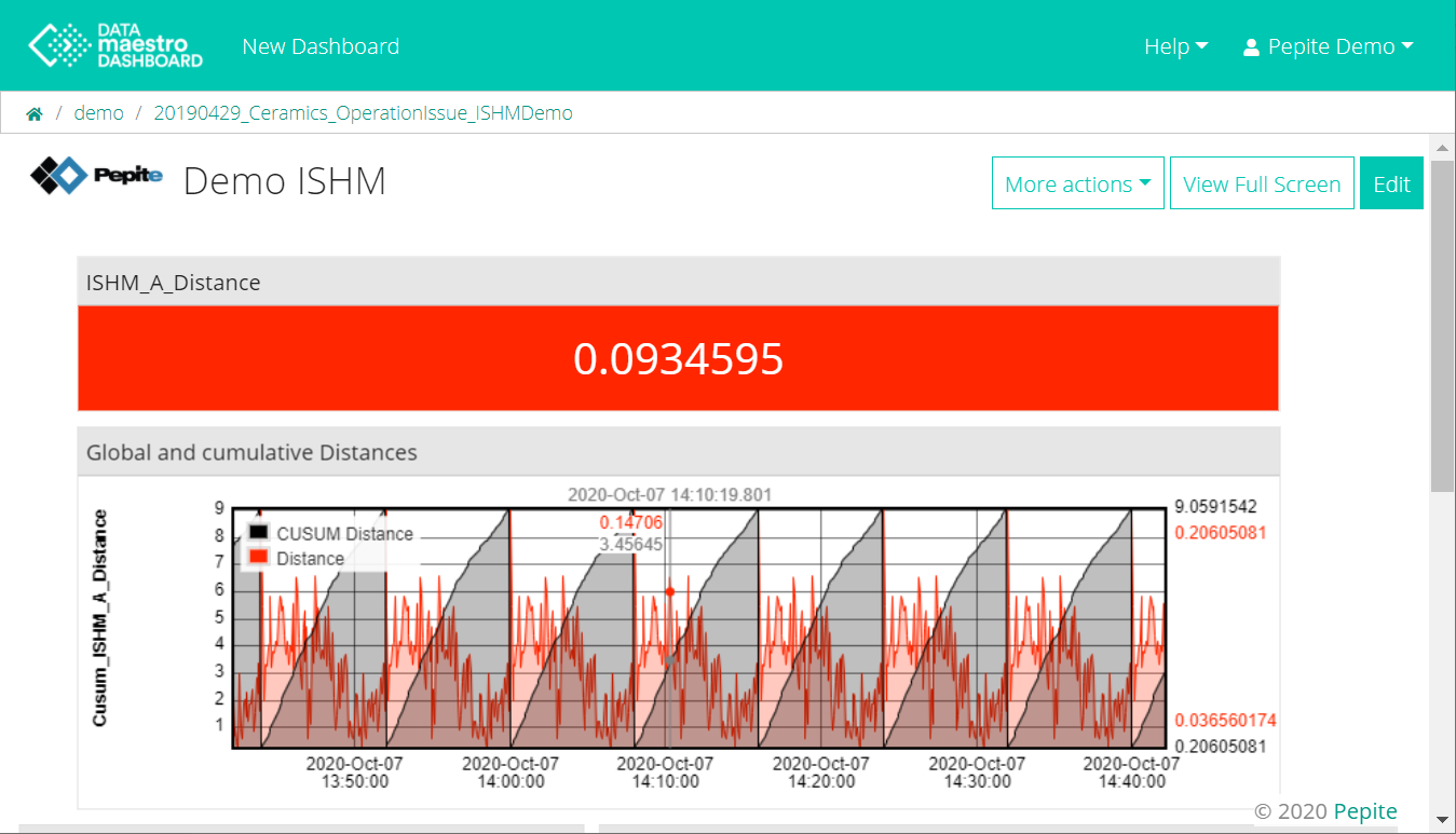
Add ISHM model resultThis widget inserts an existing ISHM model from the DmA project and calculates the current performance based on real-time data from DATAmaestro Lake. - Select in Viewer ISHM.
Assign a Title to this widget. Select Refresh Period. This defines the interval at which the trend will be refreshed and new data will be displayed. Values can vary from 1 second to more than 24 hours. If No interval the trend is not refreshed. Select Time Range. This is the window of time displayed on the trend. This windows runs backwards from the current time (on the dashboard) back the given time range. Choose a Datasource, if required (See additional information on Datasources for Dashboard widgets above). Specify the Url, User name and Password for the dataset. Click OK. Select ISHM path. The path in the lake that contains the ISHM computed variables. Select Data Path. The path in the lake that contains the tags referenced by the ISHM causes. This defaults to the same value as the ISHM path. Enter a Tag Prefix. The prefix that will be used to build tag names from ISHM cause values. Defaults to ISHM task name. - In Trend, select the tags e.g. ISHM global distance and Cumulative sum of the ISHM_Distance.
Choose a Color from the palette. Display data points on trends. Link data points. Fill below the curve.
Click OK.
| Info |
|---|
| title | Value checker for ISHM Distance |
|---|
| Add to the ISHM curve a Value Checker using the ISHM-distance. Add two thresholds with Type Value to check the ISHM distance. |
Add Ranges Checker This widget inserts a range checker which verifies if a given variable currently lies within a predetermined range. - Select in Viewer Ranges Checker.
Assign a Title to this widget. Select Refresh Period. This defines the interval at which the new data is displayed. Values can vary from 1 second to more than 24 hours. If No Interval the range checker is not refreshed. Choose a Datasource, if required (See additional information on Datasources for Dashboard widgets above). Specify the Url, User name and Password for the dataset. Click OK. To define the variable to monitor: Select Folder. Select a Tag. Enter a Title, if required. Enter a Unit, if required. Click on + Edit Thresholds. Select a Type in Edit Range checker bound: None: No value is displayed (blank). Value: Enter a numerical value (>=). Choose a Color from the palette. Task: Add Tasks refer to DATAmaestro analytics tasks (predictive models and function variables). Once a Task has been selected the input parameters used for the model are automatically detected. However, it is necessary to select the corresponding data in DATAmaestro Lake by indicating for each variable the respective Folder and the Tag Name of the Parameter. Choose a Color from the palette. Tag: Select a tag from DATAlake. Select a Folder. Select a Tag. Choose a Color from the palette. Click on Clear Thresholds to remove all thresholds defined. Click on trash icon beside each threshold to delete one at the time.
Define a Label to assign a label to the variable. If not determined the tag name (Folder/Tag Name) is assigned. Enter a Unit, if required. Click on Delete a Tag, if required.
Repeat to select all required variables to monitor (variables may be selected from different folders). Click OK.
Add Value Checker This widget inserts a value checker which verifies if a given variable currently lies within a predetermined range. - Select in Viewer Value Checker.
Assign a Title to this widget. Select Refresh Period. This defines the interval at which the new data is displayed. Values can vary from 1 second to more than 24 hours. If No Interval the range checker is not refreshed. Choose a Datasource, if required (See additional information on Datasources for Dashboard widgets above). Specify the Url, User name and Password for the dataset. Click OK. Select a Folder. Select a Tag. Enter Unit, if required. Enter Font size, if required. Example: 15pt. Click on + Add Threshold. Enter a numerical Value (>=). Select a Color from the palette. Select a Background Color from the palette, if required. Click on Clear All to clear all values. Click OK.
Add Gauge Checker This widget inserts a gauge checker which verifies if a given variable currently lies within a predetermined range. - Select in Viewer Gauge Checker.
Assign a Title to this widget. Select Refresh Period. This defines the interval at which the new data is displayed. Values can vary from 1 second to more than 24 hours. If No Interval the range checker is not refreshed. Choose a Datasource, if required (See additional information on Datasources for Dashboard widgets above). Specify the Url, User name and Password for the dataset. Click OK. Select a Folder. Select a Tag. Enter Minimum Value. Enter Maximum Value. Enter Unit, of required. Click on + Add Threshold. Select a Type: None: No value is displayed (blank). Value: Enter a numerical value (>=). Choose a Color from the palette. Select a Background Color from the palette, if required. Task: Add Tasks refer to DATAmaestro analytics tasks (predictive models and function variables). Once a Task has been selected the input parameters used for the model are automatically detected. However, it is necessary to select the corresponding data in DATAmaestro Lake by indicating for each variable the respective Folder and the Tag Name of the Parameter. Choose a Color from the palette. Select a Background Color from the palette, if required. Tag: Select a tag from DATAlake. Select a Folder. Select a Tag. Choose a Color from the palette. Select a Background Color from the palette, if required. Click on Clear Thresholds to remove all thresholds defined. Click on trash icon beside each threshold to delete one at the time.
- Select Link Dashboard (Optional), this will help when creating several levels of Dashboards.
- Select Project and Dashboard to create link.
Click OK.
| Info |
|---|
| Display the last value date on the gauge and Link Dashboards. 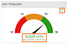 |
Add Real time Decision tree
This widget inserts an existing Decision Tree from the DmA project and calculates the current performance based on real-time data from DATAmaestro Lake. - Select in Viewer Real Time / Decision tree.
Assign a Title to this widget. Select Task. The list contains all decision trees created in the DmA project. Once a Task has been selected the input parameters used for the model are automatically detected. However, it is necessary to select the corresponding data in DATAmaestro Lake by indicating for each variable the Folder and the Tag Name of the Parameter. Select Refresh Period. This defines the interval at which the new data is displayed. Values can vary from 1 second to more than 24 hours. If No interval the decision tree is not refreshed. Choose a Datasource, if required (See additional information on Datasources for Dashboard widgets above). Specify the Url, User name and Password for the dataset. Click OK. Click OK.
Add Custom Table This widget inserts a custom table. - Select in Viewer Custom Table.
Assign a Title to this widget. Enter number of Rows. Enter number of Columns. Enter Font size, if required. Example: 15pt. On the table, click on the selection icon  . . Select a Type of a cell: Text: enter a Value. Choose a Color from the palette. Value: Enter a numerical value, a task or a tag . Select a Value: Choose a Datasource, if required (See additional information on Datasources for Dashboard widgets above). Specify the Url, User name and Password for the dataset. Click OK. Choose a Tag. Click on the checkbox Display Tag Name? , if the Tag Name should be displayed. - Click on the checkbox Display Value Date? , if the last value date should be displayed.
Enter tag Unit, if required. You can also click on Fetch unit from Lake metadata. - Enter tag Label, if required. You can also click on Fetch label from Lake metadata.
Click + Add Threshold. Select Type: None: No value is displayed (blank). Value: Enter a numerical value (>=). Choose a Color from the palette. Task: Add Tasks refer to DATAmaestro analytics tasks (predictive models and function variables). Once a Task has been selected the input parameters used for the model are automatically detected. However, it is necessary to select the corresponding data in DATAmaestro Lake by indicating for each variable the respective Folder and the Tag Name of the Parameter. Choose a Color from the palette. Tag: Select a tag from DATAlake. Select a Folder. Select a Tag. Choose a Color from the palette. If the tag is symbolic, select Edit symbols mapping. Click on Clear Thresholds to remove all thresholds defined. Click on trash icon beside each threshold to delete one at the time.
Metadata: Add Metadata corresponding data in DATAmaestro Lake. Select Refresh Period. This defines the interval at which the new data is displayed. Values can vary from 1 second to more than 24 hours. If No interval the decision tree is not refreshed. Choose a Datasource, if required (See additional information on Datasources for Dashboard widgets above). Specify the Url, User name and Password for the dataset. Click OK. Select a Folder. Choose a Tag. Click on the checkbox Display Tag Name? , if the Tag Name should be displayed. Click on the checkbox Display Tag Title? , if the Tag Title should be displayed. Click on the checkbox Display Tag Unit? , if the Tag Unit should be displayed. Click + Add Threshold. Select Type: None: No value is displayed (blank). Value: Enter a numerical value (>=). Choose a Color from the palette. Task: Add Tasks refer to DATAmaestro analytics tasks (predictive models and function variables). Once a Task has been selected the input parameters used for the model are automatically detected. However, it is necessary to select the corresponding data in DATAmaestro Lake by indicating for each variable the respective Folder and the Tag Name of the Parameter. Choose a Color from the palette. Tag: Select a tag from DATAlake. Select a Folder. Select a Tag. Choose a Color from the palette. Click on Clear Thresholds to remove all thresholds defined. Click on trash icon beside each threshold to delete one at the time.
- Select Link Dashboard (Optional), this will help when creating several levels of Dashboards.
- Select Project and Dashboard to create link.
Click OK.
| Info |
|---|
| title | Value date & replace Symbol |
|---|
| Display the last value update date on Custom Tables. Replace Symbols or Tag Names by Titles. |
Add SPC Trends This widget inserts a Statistical Process Control (SPC) real time trend. - Select in Viewer SPC Trend.
Assign a Title to this widget. Select Refresh Period. This defines the interval at which the new data is displayed. Values can vary from 1 second to more than 24 hours. If No Interval the range checker is not refreshed. Choose a Datasource, if required (See additional information on Datasources for Dashboard widgets above). Specify the Url, User name and Password for the dataset. Click OK. Select a Time Range. In SPC Parameters, select the Trend tag. Choose a Color from the palette. Enter mininum Y value in Min Y. Enter maximum Y value in Max Y. Check the box to Display data points on trends. Check the box to Link data points. Check the box to Fill below the curve. Enter a Label.
Enter Upper Limit. Enter the Type. There are two options : Tag or Value. Choose a Color from the palette. Select Style, dashed line or solid line.
Enter Upper Limit. Enter the Type. There are two options : Tag or Value. Choose a Color from the palette. Select Style, dashed line or solid line.
Enter Central Line. Choose a Color from the palette. Select Style, dashed line or solid line.
In Moving Range, check + Add Moving Range Chart. The Moving Range is a trend calculated on the SPC Trend with the formula : mrY = |yi - y(i-1)| with mrY the Moving Range point and yi the SPC Trend point. The Moving Range will have the same violations rules as the SPC Trend. Add SPC additional rules. Click + Add a Rule. Select a Rule. Check the table below to understand the options available.
Click OK.
The SPC Violation rules, a point is highlighted when: Rule | Description |
|---|
Outside a Limit | The point is outside a control limit (UCL or LCL) | Above the Mean | x points in a row are above the central line | Below the Mean | x points in a row are below the central line | An Upwards Trend | x points in a row are following an upwards trend | A Downwards Trend | x points in a row are following a downwards trend | Alternating Up and Down | x points in a row are alternating up and down | Zone A or Beyond | x out of y points in a row are in zone A or beyond | Zone B or Beyond | x out of y points in a row are in zone B or beyond | In Zone C | x points in a row are in zone C only | Not in Zone C | x points in a row are in not in zone C |
To calculate the Zone, the UCL and LCL are considered 3 sigma from the central line. | Rule | Description |
|---|
| Zone A | from a control limit to 2 sigma: [2σ - UCL] & [LCL - -2σ] | | Zone B | from 2 sigma to 1 sigma: [1σ - 2σ] & [-2σ - -1σ] | | Zone C | from 1 sigma to the central line: [0σ - 1σ] & [-1σ - 0σ] |
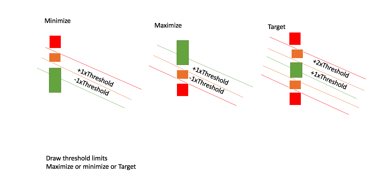
Add Load Curve The custom Load Curve widget draws a polynomial curve, shows the last data point and colours the last data point as a function of the position with respect to the polynomial curve. This is a particularly interesting curve for Energy performance monitoring. - Select in Viewer Load Curve.
Assign a Title to this widget. Write in the script area. An script example is shown here below. Some properties that can be added to the script: - Under viewer, enter “loadCurve.html"
- drawThresholdLimits: true or false
- Xrange: Defines min and max values for X axis
- xTag: Enter the full tag path
- yTag: Enter the full tag path
- Coefficients: This are the coefficients for a polynomial equation in ascending order (x0, x1, x2, x3, x4, …)
- Interval: Frequency of widget refresh (ms)
- Threshold: Defines limit for red, orange or green data point
Above the curve defined by the “coefficients” the point will be red. Below the curve, until the « warning limit » the point will be orange. Beyond that, the point will be green.
- yLabel: Title for y axis
- xLable: Title for x axis
- yRange: Defines min and max values for X axis
- goal: "maximize", "minimize" or "target".
- Click OK.
| Code Block |
|---|
| title | Load Curve widget |
|---|
| linenumbers | true |
|---|
| collapse | true |
|---|
| threshold remplaces warningLimit
goal: "maximize" or "minimize" or "target"
drawThresholdLimits: true or false
{
"drawThresholdLimits": true
"xRange": {
"min": -2,
"max": 2
},
"goal": "maximize",
"xTag": "/demo/test1",
"yTag": "/demo/test2",
"coefficients": [
0,
-1
],
"interval": 1000,
"threshold": 0.5,
"yLabel": "y",
"xLabel": "x",
"yRange": {
"min": -2,
"max": 2
},
"goal": "maximize"
}
|
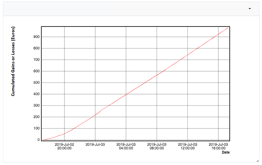
Add Moving CUSUM The custom Cusum widget calculates the cumulative sum of any tag starting from zero. - Select in Viewer Moving Cusum.
Assign a Title to this widget. Write in the script area. An script example is shown here below. Some properties that can be added to the script. All parameters are options exception to that is Tag. Period and interval are in milliseconds. - Under viewer, enter “movingCusum.html”
- Period: Time window of the cumulative sum (ms)
- Interval: Frequency of widget refresh (ms)
- Tag: it is the tag to be summed and displayed on the graph
- Factor: Multiplication factor of the tag.
- This can be helpful to account for units as the widget calculates the integral on a second basis.
- Eg. If the tag units are T per hour: Tag T / h * 1h / 3600s to calculate the correct T value (1/3600 = 0.00027777778)
- yLabel: Title for y axis
- Click OK.
| Code Block |
|---|
| title | Moving Cusum widget |
|---|
| linenumbers | true |
|---|
| collapse | true |
|---|
| {
"period": 86400000,
"interval": 3600000,
"tag": "client/site/area/computed/GAP_KPI-Steam-Spec-Def",
"factor": 0.00027777778,
"yLabel": "Cumulated Gains or losses (Euros)",
"xLabel": "Date"
}
|
Edit Widgets Click on arrow on top right of the widget. - Click on Edit.
- Make changes.
- Click on OK button to save it.
- Delete an existing Widget
- Click on arrow on top right of the widget.
- Click on Delete (Trash Icon).
To Edit a dashboard: - Enter on DATAmaestro Analytics project.
- On the vertical menu bar, click on the first icon , click on View.
- If there is only one dashboard, click on Edit.
- If there are several ones, select the dashboard to be edited using View then, click on Edit. Otherwise, on the vertical menu bar click on Edit icon.
| Info |
|---|
| title | If you don't want to Save the changes in dashboard |
|---|
| If you don't want to save the changes you've made in the dashboard just click on stop icon  . . |
To Delete a dashboard: - Enter on DATAmaestro Analytics project. On the vertical menu bar, click on the first icon , click on View.
- If there is only one dashboard, click on Edit.
- If there are several ones, select the dashboard to be edited using View then, click on Edit. Click on the trash icon
 to delete the dashboard. Otherwise, on the vertical menu bar click on Delete icon. to delete the dashboard. Otherwise, on the vertical menu bar click on Delete icon.
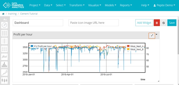
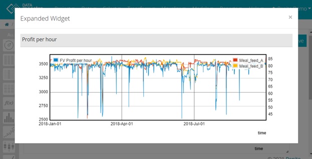
To expand widgets on dashboards:
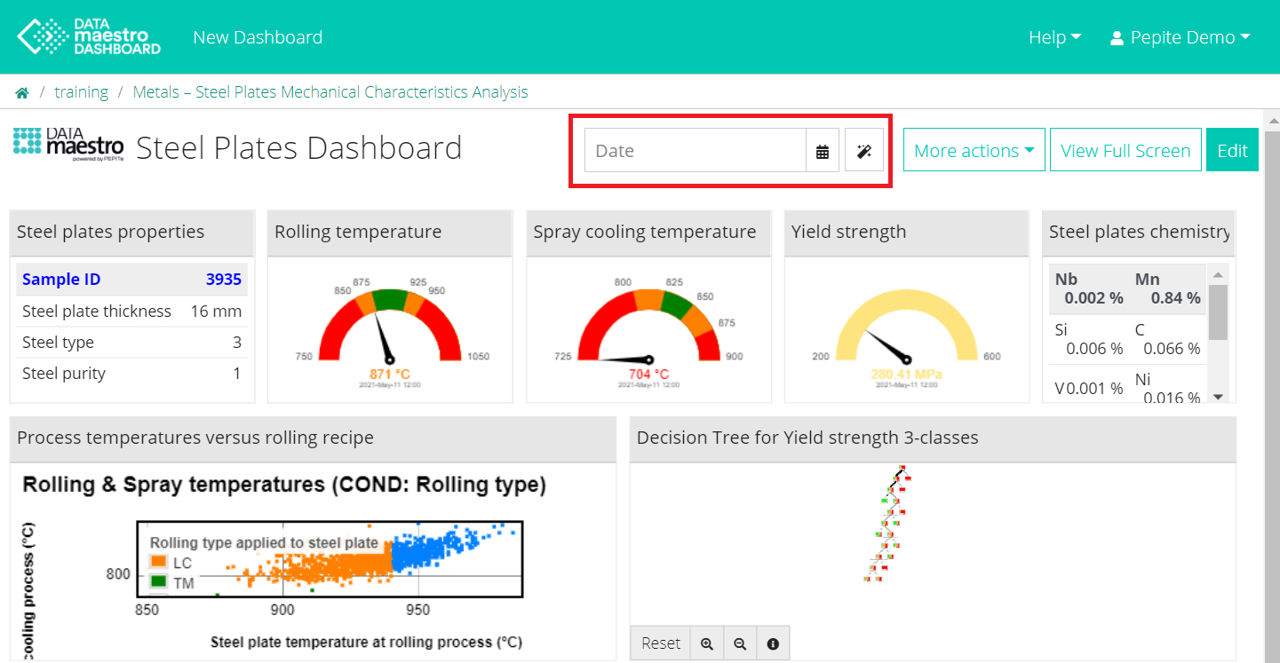
To change date to view dashboard in the past: - Enter on DATAmaestro Analytics project. On the vertical menu bar, click on the first icon , click on View.
- Use the calendar or magic wand to select a date (in the past) or manually edit the date you wish to see.
| Info |
|---|
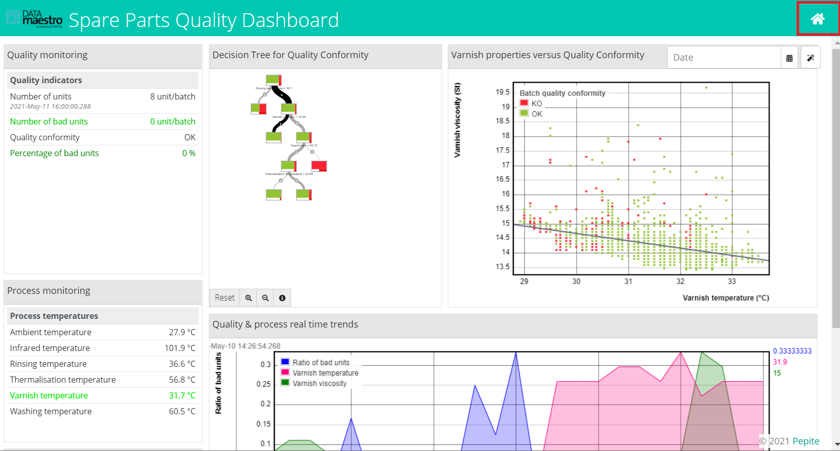
| In full-screen mode, use the “Home” button to change between dashboards |
| Info |
|---|
| Create several levels of Dashboards and drill-down using linked DATAmaestro Dashboards. |
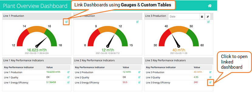
- Select Link Dashboard on Gauges or Custom Tables.
- Select Project & Dashboard to create link.
| Info |
|---|
| You can now play and pause real time dashboards. |
|