Versions Compared

Key

  • This line was added.
  • This line was removed.
  • Formatting was changed.

...

English us

Duration curve or load duration curve illustrates the variation of a load with a percentage of time. The load levels, in axis y, are in descending order of magnitude.

Create a duration curve:

On the Properties tab: 

  1. Click Visualize > Duration curve in the menu.
  2. Select an Record set from the list, if required.
  3. Select from the Variable list and to set a variable for Y.
  4. Click Save

On the Advanced tab: 
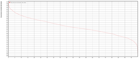
  1. Enter a chart Title.
  2. Enter Font Size, if required. 
  3. Select Fill curves to color the area below the curve.
  4. Click Save to load the data.


Example Visualization

The following example illustrates the gas pressure of a foam seal is at 223.5 mbar during 50% of the time.  


Japanese

持続曲線


持続曲線


持続曲線 (負荷持続曲線) は、時間の割合を使用して負荷の変動を示します。Y 軸の負荷のレベルは、大きさの降順で示されます。

持続曲線の作成

[プロパティ] タブ: 

  1. メニューで [視覚化] > [持続曲線] をクリックします。
  2. 必要に応じて、リストから[オブジェクトセット]を選択します。
  3. [属性] リストから選択し、Y の属性を設定します。
  4. [保存] をクリックします。 

[詳細] タブ: 

  1. グラフの[タイトル]を入力します。
  2. 必要に応じて、[フォントサイズ]を入力します。 
  3. 曲線の下の領域に色を付けるには、[曲線の塗りつぶし] を選択します。
  4. [保存] をクリックしてデータを読み込みます。


視覚化の例

次の例は、時間の 50% の期間は、発泡シール材のガス圧力が 223.5 ミリバールであることを示します。  


Image Added